Picking up from last week's assignment about the Pitch, I've narrowed my idea to one topic. Here is a descriptive treatment for the "Body Shop" concept.
The Body Shop, Running Time 30 seconds (in Word Format)
The Body Shop, Running Time 30 seconds (in PDF Format)
Enjoy!
Sep 29, 2006
Sep 22, 2006
Final Project Pitches
Hey there!
Here are 3 concept descriptions for my project pitch(es):
Disgruntled Character
Technique: Type Animation
A character/symbol becomes disgruntle because of its' sparse usage in a comic strip panel and decides to act its frustration out against the other letters. Tracking will be used to superimpose typography against the movements of an actor.
The Body Shop
Technique: Greenscreening + Tracking
Instead of people shopping for clothes at a store, clothing shops for bodies to wear them. Actors in costume will be superimposed and tracked digitally.
Virtual Postcard
Technique: Morph
A ride in the park for a couple becomes a trip down memory lane. As the riders pass objects in the park, the objects morph into other elements that are connected to activities which occurred in the past.
Sep 13, 2006
Visual inspiration
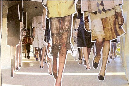 I found this image in the August issue of Creative Review magazine. I really like the way the design studio, 2x4, fills the space with these larger than life cutouts for a fashion exhibition back in 2004. At first glance, I thought this image was of a bustling sidewalk in some major metropolitan city because of the way each figure is staggered. One image overlaps another giving the illusion of depth.
Another attribute I like is how the designers used the negative white space as a design element to outline each figure. I think of kewpie dolls or paper cutouts when I see it. It helps re-enforce the idea of 2-d objects interacting within a 3d space. That's pretty cool I say.
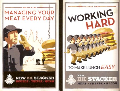 Werd! I remember seeing these ads all over Soho this summer. These are my favorite! And not just because I'm a carnivor. Ha! This image was also in the August issue of CR. Anyways, when I first saw these ads, on walls all around Broome Street and 6th Ave, I thought "hmm these remind me of old propaganda posters from the 1930s." And sure enough that's what the team from Crispin, Porter & Bogusky were trying to emulate in their designs. I love the type treatments. Everything is indicative to the WPA era from the minimal composition detail which gives you just enough visual information to explain the form, to almost heroic arrangement of the prominent figure or key visual. Those hard hats are too much! Is that style even around these days? The use of perspective is wonderful too! I'm a huge fan of authenticity. This is the way to take a concept/theme and carry it out from start to finish.
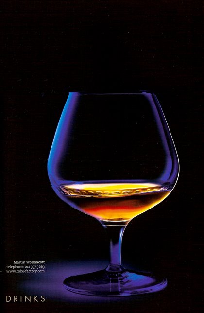 Alright, the scan doesn't really do justice to image, but you get the general idea.
When I look at this glass I imagine it's going to shatter if I stare too long! There's barely a hint of the glass. It's almost as if the brandy is floating in space. Mmmm I don't think a bottle of Old E can pull off the same type of response as this image. Words like elegance, pure, and sexy come to mind. The essence of a blue light are what reminds us of the form. Yeah I think the lighting is superb!
Sep 8, 2006
Subscribe to:
Posts (Atom)
